


When the Account Executive for this account brought up this project, I was floored because it was a match made in heaven.
The client was Baumhaus, a luxury apartment complex being developed on Baum Boulevard in Pittsburgh. They wanted a sophisticated mark, which pushed the envelope to make them stand out among their competition.
The client was Baumhaus, a luxury apartment complex being developed on Baum Boulevard in Pittsburgh. They wanted a sophisticated mark, which pushed the envelope to make them stand out among their competition.
Since I lean towards minimalism, I was excited about all the avenues I could investigate. The Account Executive had a catch though...I only had four days to get this done.
I could have thrown my hands up and said nope, not happening, but I powered through and my favorite piece of my career came out the other side.
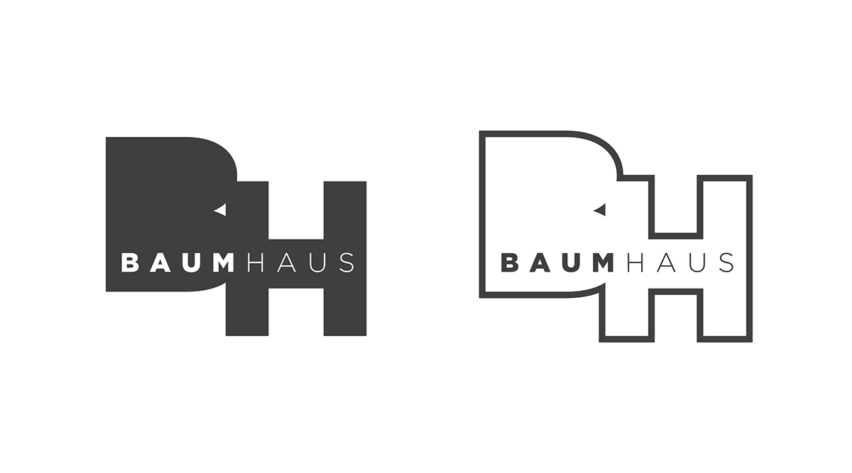
Avenue 1 - Tree House

Since Baumhaus translates from German to English to mean "Tree House", I went after this idea first, for two reasons. One was because that's what it means, and the second was that the building itself is very energy efficient and has many open, green spaces to enjoy as a tenant. This was a point the client wanted to go after, so I kept this at the forefront of my mind when creating.
This first go at it did not work at all, it was sophisticated in the fact that it was one color, had thin lines and was interesting to look at, but did not communicate anything. It was hard to read the BH when it was a spelled out in sticks, at first glance you didn't really know what it was, and the heaviest part was a hexagon, which could make the viewer think the BH stood for BeeHive.

The second round of Tree House ideas were a little stronger, showed sophistication with the negative shape of the house, and communicated that it was somewhere to live, but it also looked like a piece of bread at the same time, so the bottom ideas were out, but the top left idea played off of the name, created an icon to stamp everywhere and have a little fun. I decided to keep that one in the running.
Avenue 2 - Strong Typographic Mark
This was a simple execution, and kind of made the shape of a building looking at it from the top down. It had the full name, with focus on the word Baum, since it is on Baum Boulevard. It also had this sort of athletic trait to it, that didn't really match, but it felt right.

Still playing off the BH, I went for sophistication in the retro sense, playing off 50's style line work. but at a quick glance the letters are lost and make confusing shapes. This part of the journey was fun to play with the container of the logo, and maybe it needs an outline.
But my brain just kept coming back to the stacked version at the bottom of the above image.
The letter count was the same for both words, the monospaced font I found for the retro look worked really well when stacked, and would you look at that...both words have an "A" and an "U" in the same position. Time to go after that!
Avenue 3 - AU YEAH

Having each word share the letters A and U was my next goal, super easy to do with the U, just drag the top points up.
Not so easy with the A. First try, didn't work. but what if I...FLIP THE U!

Flipping the U to create my A, with a nice centered crossbar to finish it off. Time to play with the container idea and see if it helps or hurts.
Adding The Container

The container I added was a square with two rounded corners and two square corners. The rounded corners were used to show the warmth and natural side to the building, and the square corners were used to hint at the square edges of the building itself. The contrast between the corners of the container helps communicate the contrasts of life at Baumhaus.

These are the five options we presented to the client, options 1 and 3 were designed by another team member, and the rest were mine. The client picked option 5!
Brand Application Concepts
This is a logo animation to show off the shared letters between the two words.

Print Ad concept playing off the shared letters of "Your" and "Home", helping people see themselves living at Baumhaus.

Business card idea where the corners would be rounded to match the logo.
Thanks!


